Thursday, March 22, 2012

High Performance Webapps. jQuery Objects as Arrays.

After recently participation in a workshop Real Life JS: High Performance Webapps. I have decided to share some tricks to achieve better perfomance for websites. There are 100+ tricks. It's impossible to covers all of them. In this post I would like to show a difference between using of jQuery calls and JavaScript native ones. Especially using of $.each() method for iteration is the topic of this post. I already knew that using of $.each() is slow. This fact is described in 15 Powerful jQuery Tips and Tricks for Developers (chapter 3). What is an alternative to $.each()? How to iterate faster on result set of running a selector? The result of running a selector is an jQuery object. However, the library makes it appear as if you are working with an array by defining index elements and a length. Use a native JavaScript for or while loop on the result. Check this example please. Perfomance benefit is huge in my opinion. I also learned that any method call in JavaScript brings a lot of overhead. I also learned that literal notation like this one
var myArray = [];
var newElement = "test element";
myArray[myArray.length] = newElement;
always works faster than
var myArray = new Array();
var newElement = "test element";
myArray.push(newElement);
Never call new operator if you can use literal notations for arrays and objects in JavaScript. Never call methods like push() if you can do this in another way. Difference in execution time of the code parts above is significant in loops. The main rule here: "Less operations per iteration - less execution time. Doing nothing is the best from performance point of view". An example of bad programming would be
for(var i=0; i < myArray.length; i++) {
    ...
}
because length is not cached and myArray.length is executed for each iteration step.

Today, I've played a little bit with the new great feature in PrimeFaces jQuery Selector API meets JSF. My aim was to compare $.each(), array's push() and $.attr() calls with native JavaScript calls. I prepared a small test page with a simple selector and the code from PrimeFaces core.js. Alternative I rewritten the code in PrimeFaces with native calls to show the difference. First, I ended up with this code. The main code is here:
var selector = "@(ul li)";
var jqSelector = selector.substring(2, selector.length - 1);
var components = $(jqSelector);
var ids = [];

console.time('Native Loop');
var length = components.length;
for(var i=0; i < length; i++) {
    ids[length] = $(components[i]).attr('id');
}
console.timeEnd('Native Loop');

console.time('jQuery Each');
components.each(function() {
    ids.push($(this).attr('id'));
});
console.timeEnd('jQuery Each');
My Firefox 11 shown (average time):

Native Loop : 28 ms
jQuery Each : 37 ms

IE8 shown:

Native Loop : 249 ms
jQuery Each : 281 ms

After that I deleted $ around components[i] in the for loop and replaced $.attr('id') by native .getAttribute('id') (what I always use in my not jQuery / JSF apps). Changes:
var length = components.length;
for(var i=0; i < length; i++) {
    ids[length] = components[i].getAttribute('id');
}
Look this test page please. Now we have in Firefox 11:

Native Loop : 3 ms
jQuery Each : 42 ms

and in IE8:

Native Loop : 14 ms
jQuery Each : 274 ms

Perfomance benefit in IE8 (with choosen selector) is 260 ms. Not bad. This trick can give more performance optimization in a huge page. I'm not a game developer and don't develop critical web applications. But a performance optimization is always good for me anyway. Optimization means not only CSS and JavaScript optimization. Loading of images / icons can be optimized as well. Next post(s) will cover more such stuff.

Sunday, March 18, 2012

Show error messages in tooltips with PrimeFaces Extensions

One user of PrimeFaces Extensions brought me to an idea to support global tooltips with jQuery selectors. This requirement was done in the current 0.4.0 release. Such enhancement prevents putting of many tooltips to a page. One of use cases would be error messages for invalid components in a big forms. On crowded forms it is preferable to show error messages in tooltips. How to do this? The idea is to apply a global tooltip to invalid components with forSelector="ui-state-error". All invalid components have the style class "ui-state-error".

How does it look?


How does it work?
 
<h:panelGrid id="details" columns="2">
    <pe:requiredLabel for="firstName" value="First Name: "/>
    <p:inputText id="firstName" required="true" title="#{component.valid ? '' : 'First Name can not be empty'}"/>
    <pe:requiredLabel for="lastName" value="Last Name: "/>
    <p:inputText id="lastName" required="true" title="#{component.valid ? '' : 'Last Name can not be empty'}"/>
</h:panelGrid>

<p:commandButton value="Submit" process="details" update="details"/>

<pe:tooltip global="true" position="left center" targetPosition="right center" forSelector=".ui-state-error"/>
 

Easy? Check this use case here please.

Edit: More generic and better solution if you use EL 2.x:
...
<p:inputText id="firstName" required="true"
        label="First Name" title="#{component.valid ? '' : myController.getErrorMessage(component.clientId)}"/>
...
<p:inputText id="lastName" required="true"
        label="Last Name" title="#{component.valid ? '' : myController.getErrorMessage(component.clientId)}"/>
...
Controller bean:
public String getErrorMessage(final String clientId) {
    Iterator<FacesMessage> iter = FacesContext.getCurrentInstance().getMessages(clientId);
    if (iter.hasNext()) {
        return iter.next().getDetail(); // or getSummary()
    }

    return "";
}
The same is for all fields and validators like <f:validateXYZ .../>. You can also customize default message text in JSF validators. Standard JSF validators store messages under well-defined keys. Refer JSF docu please how to do this.

Saturday, March 17, 2012

PrimeFaces Extensions 0.4.0 released

I'm pleased to announce the new release of PrimeFaces Extensions. It's fully compatible with the last PrimeFaces 3.2 release.

Please see releases notes and the showcase which shows now new and updated components / use cases. This release is available in the Maven central repo as usually.

What is the next? In the next release we will add some new components, extend already existing and improve generated documentation on basis of Vdldoc and JSDoc. The showcase will have a CSS section as well. Furthermore, Maven plugin for web resource optimizations will get a new feature - handling of dataURIs. The intention is to convert referenced in CSS files images to dataURIs. This technique is better than sprites and allows to avoid HTTP overhead for each small image and load pages faster.

And of course the next release will be fully compatible with the PrimeFaces 3.3 and its new ajax features.

Stay tuned.

Wednesday, March 14, 2012

Power of MasterDetail component

PrimeFaces Extensions project has a component called MasterDetail. This component was created with the aim to get rid of big dialogs which are error-prone. This is the most complex component with 9 Java classes under the hood. MasterDetail component allows to group contents into levels (sections) and saves page space. Smart and flexible navigation between levels via built-in breadcrumbs or command components gives a stylish interface for users. Each level in the flow is represented with a MasterDetailLevel component. Switching between levels occurs by means of SelectDetailLevel handler and is based on ajax, that means each level is loaded dynamically by ajax. SelectDetailLevel can be attached to any PrimeFaces component implementing UICommand. Such typically components are CommandLink, CommandButton, MenuItem, RemoteCommand and HotKey. Components with p:ajax are supported as well.

MasterDetail component can have hundreds of different looks. It's not limited to wizard like look as PrimeFaces wizard. A typically markup structure looks as follows:
<pe:masterDetail level="#{masterDetailBean.currentLevel}">

    <pe:masterDetailLevel level="1" levelLabel="Sports">
        <p:dataTable id="sports" value="#{masterDetailBean.sports}" var="sport">  
            <p:column headerText="Sport">  
                <p:commandLink value="#{sport.name}">  
                    <pe:selectDetailLevel contextValue="#{sport}"/>  
                </p:commandLink>  
            </p:column>  
        </p:dataTable>
    </pe:masterDetailLevel>
 
    <pe:masterDetailLevel level="2" contextVar="sport" levelLabel="Countries having #{sport.name} leagues">
        <p:dataTable id="countries" value="#{sport.countriesWithLeague}" var="country">  
            <p:column headerText="Country">  
                <p:commandLink value="#{country.name}">  
                    <pe:selectDetailLevel contextValue="#{country}"/>  
                </p:commandLink>  
            </p:column>  
        </p:dataTable>
    </pe:masterDetailLevel> 
 
    <pe:masterDetailLevel level="3" contextVar="country" levelLabel="#{country.sport} leagues of #{country.name}">
        <p:commandButton value="Go to Sports">
            <pe:selectDetailLevel level="1"/>
        </p:commandButton>
        <p:commandButton value="Go to Countries">
            <pe:selectDetailLevel step="-1"/>
        </p:commandButton>
    </pe:masterDetailLevel>

</pe:masterDetail>
You see that each level has a required "level" attribute. Value of "level" attribute should be unique. Navigation by SelectDetailLevel gives a flexible and powerful capability to control partial validation and to call standard action / actionListener during navigation. SelectDetailLevel can pass context values (any objects) from level to level and make them available via context variables. Level to go to can be set via "level" or "step" attribute (default is step=1 if nothing specified). Text for breadcrumb items is set by "levelLabel" attribute or "label" facet of MasterDetailLevel component.

Area to be updated / processed during navigation between levels is set automatically to the MasterDetail component - no needs to specify it in "process" / "update" attributes of command component SelectDetailLevel is attached to. But of course, this area can be also controlled more precise by "update" / "process" attributes. Partial validation can be e.g. skipped by setting process="@none" or immediate="true". Partial validation in case of the navigation via breadcrumbs is always skipped automatically. Other features are a server-side listener invoking when a navigation attempt takes place, "header", "footer" facets, implicitly navigation without pe:selectDetailLevel and more.

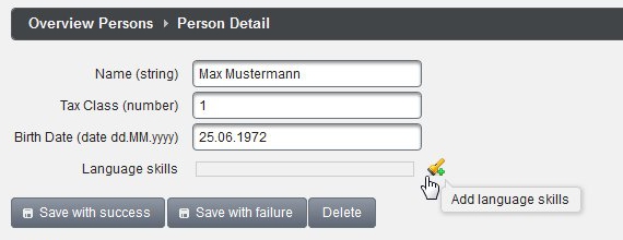
Next two screenshots show an example with two levels. The first level is a overview table with all persons. The second level represents a detail view to current selected person.


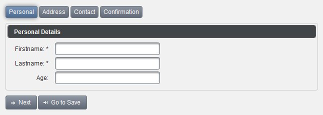
The next screenshot shows another use case with a custom header area. Built-in breadcrumb is replaced by wizard like visual steps.


This can be achieved by this code:
<pe:masterDetail level="#{masterDetailBean.currentLevel}" showBreadcrumb="false">  
    <f:facet name="header">  
        <pe:messages showDetail="true"/>  
        <h:panelGroup layout="block" style="margin-top: 10px;">  
            <h:panelGroup styleClass="levelTitle ui-state-default ui-corner-all  
                          #{masterDetailBean.currentLevel eq 1 ? 'ui-state-hover' : ''}">  
                <h:outputText value="Personal"/>  
            </h:panelGroup>  
            <h:panelGroup styleClass="levelTitle ui-state-default ui-corner-all  
                          #{masterDetailBean.currentLevel eq 2 ? 'ui-state-hover' : ''}">  
                <h:outputText value="Address"/>  
            </h:panelGroup>  
            <h:panelGroup styleClass="levelTitle ui-state-default ui-corner-all  
                          #{masterDetailBean.currentLevel eq 3 ? 'ui-state-hover' : ''}">  
                <h:outputText value="Contact"/>  
            </h:panelGroup>  
            <h:panelGroup styleClass="levelTitle ui-state-default ui-corner-all  
                          #{masterDetailBean.currentLevel eq 4 ? 'ui-state-hover' : ''}">  
                <h:outputText value="Confirmation"/>  
            </h:panelGroup>  
        </h:panelGroup>  
    </f:facet>  
  
    <pe:masterDetailLevel level="1">
        ...
    </pe:masterDetailLevel>
 
 ... more levels ...
 
</pe:masterDetail>
Check the PrimeFaces Extensions showcase please to get more source code. You can see especially the case with a server-side selectLevelListener which allows to control the level to be navigated (success vs. error case).

Saturday, March 3, 2012

PrimeFaces is taking off and Extensions project is on board

We are glad to announce that PrimeFaces Extensions team released yesterday the new version 0.3.0. A trailer is available. Watch it please.


Released version is available in the Maven central repository. Here are quick Release Notes for this release:

  • Built on top of current PrimeFaces 3.1.1.
  • Improved the showcase, deployed for Mojarra and MyFaces now.
  • Added internationalisation page.
  • Bugfixes for existing components.
  • Added new component CodeMirror.
  • Added new component TimePicker.
  • Added new component Timeline.
  • Added new component TriStateCheckbox.
  • Added new component TriStateManyCheckbox.

Check also our Mojarra based and MyFaces based showcase. In the next posts I will go unter cover and explain some interesting components more detailed.

We have two new team members: Nilesh Mali and Mauricio Fenoglio. Nilesh is a specialist in Google Maps and Open Street APIs and will implement extended map functionalities with tracking functions. He implemented Timeline component. This component will be re-implemented with funny UI, events, zooming, etc. in the next releases. He is also responsible for ComboCalendar in the next release. Mauricio implemented TriStateCheckbox and TriStateManyCheckbox components and will implement InfiniteScroll and NumberInput components in the next release(s). Credits to Mauricio. He created the trailer for us.

Last but not least - Credits and thanks to Cagatay Civici, the PrimeFaces lead. He was likable to use and allowed us to use a phpBB based sub-forum. Thank you!

Have fun with Extensions project!